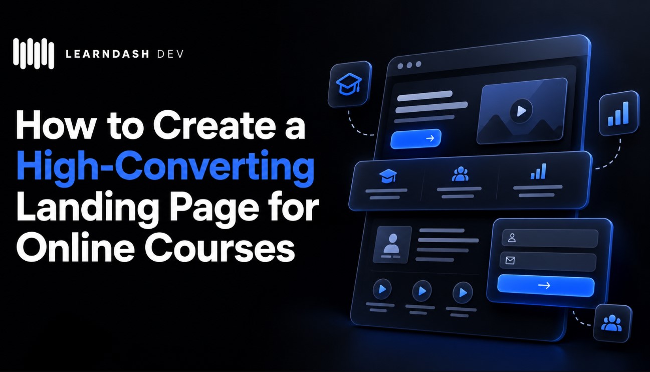
How to Create a High-Converting Landing Page
Updated: October 14, 2026
First of all, many people get confused: a landing page is not a website. And it’s not necessarily a one-pager either.
A landing page has a very specific purpose: conversion. It’s about turning visitors into clients or customers. It’s guiding someone towards a single action.
When we talk specifically about online courses, having a dedicated, well-designed landing page for each course can make a real difference. Whether you’re an independent instructor, a coach, or a company selling training programmes, you need a place to explain why someone should enrol.
A regular website can serve multiple purposes: telling a company’s story, displaying a portfolio, hosting a blog… It’s more institutional. A landing page is surgical. Direct. It has one mission only: get the person to click that button, hire your service, buy your product, or enrol in your course.
That’s why everything must be optimised. No unnecessary distractions, and no ‘I’ll check it later’. Every element should guide the user towards conversion.
A landing page can be created using many different tools, including WordPress and platforms like GoHighLevel. Nowadays, people are also building impressive landing pages with AI tools like Claude. It’s not particularly hard to get started, but if you don’t have the experience, you can outsource the work to a web development company.
You Only Have a Few Seconds
And here comes the first dose of reality: you don’t have much time to capture someone’s attention before they consider leaving your page. There’s no universal eight-second rule, but the principle remains the same: first impressions matter.
So what comes first? What stands out? How are visual elements arranged? All of this should direct the user’s eyes to your action button — the famous CTA (call to action).
If you sell courses, visitors should immediately understand what they’ll learn, who the course is for, and what they’ll be able to do after completing it. Don’t make them scroll through half the page just to discover the subject of your course.
The More Landing Pages, The More Results
Here’s an interesting stat from an older HubSpot analysis of 4,000 businesses: companies with more than 40 landing pages generated 12 times more leads than companies with five or fewer.
That research is not a promise that creating dozens of pages will automatically multiply your sales, but it illustrates the value of having pages for different offers and audiences.
In other words, if you’ve only got one generic landing page for everything you sell, you may be leaving opportunities on the table. Try different formats. Change the title, adjust the offer. Segment by audience. Increase your chances.
This is especially relevant for course creators. If you sell a beginner’s photography course, an advanced editing programme, and a short workshop, each deserves its own landing page. The content, learning outcomes, and audience are different — so the sales pitch should be different too.
But What’s a ‘Good’ Conversion Rate?
Do you know the typical conversion rate for a landing page?
If you guessed 20% or 30%… brace yourself.
According to Unbounce’s 2024 Conversion Benchmark Report, the median landing page conversion rate across industries was 6.6%. But that figure covers different types of conversions, including lead generation — not just purchases.
And that’s an important distinction for online courses. Getting someone to download a free syllabus is easier than persuading them to buy a $500 programme. A good conversion rate depends on your offer, audience, price, and traffic source.
That’s why every little detail counts. A sharper headline, a more visible button, tighter copy, all of it can make a difference.
And here’s the key: creating specific landing pages for each course can help you speak directly to the right audience. You don’t need to rely on a fixed percentage increase to see why relevance matters.
Structure of a High-Converting Landing Page
Let’s break this down. Here’s the structure of a high-converting landing page:
Killer Headline
It’s your business card. The first thing people see. It needs to create curiosity and instantly show your product’s main benefit.
Example: you’ve got a CRM. Instead of “The best CRM in the market”, which is vague and means nothing, try:
“Double your productivity in 2 weeks with our CRM.”
See the difference? Now there’s a metric, benefit, and timeframe. The reader thinks, “How? I want to know more.” Of course, any measurable claim should be something you can actually support.
For an online course, you could apply the same idea. Instead of “Complete Excel Course”, try something more specific, such as:
“Learn to build professional Excel dashboards, even if you’re starting from scratch.”
Persuasive Copywriting
A great title isn’t enough. The page content must also shine. This is where persuasive copywriting comes in. A classic structure you can follow is called AIDA:
You grab attention, hold interest, spark desire, and drive action. Simple and effective.
For online courses, focus on the student’s problem and the transformation your course offers. Explain what they’ll learn, how the lessons are organised, how long it takes, and why your teaching approach is worth their time.
Clear, Visible CTA
Don’t hide the button. Don’t confuse the user. The action button should stand out. “Buy now”, “Get access”, “Start for free”. Whatever it is, it must be clear and visible.
For a paid course, “Enrol Now” or “Get Instant Access” can work well. If the course isn’t available for purchase yet, “Join the Waiting List” may be more appropriate. The CTA should match what actually happens after the click.
Show Students What They’re Buying
This is one of the biggest differences between a general product landing page and a course landing page. People are buying knowledge and an educational experience, often from someone they haven’t met.
Show them what they’re getting: a clear curriculum, lesson previews or a short introduction video, the instructor’s background, course duration, access conditions, and genuine student testimonials when available. If you offer a refund policy, certificate, or community access, explain the conditions clearly. A simple FAQ can also help answer objections before checkout.
Landing Pages for LearnDash Courses
If you’re using LearnDash with WordPress, you have plenty of flexibility. You can create a dedicated sales landing page using the block editor or a page builder such as Elementor, while LearnDash handles the actual course structure, lessons, quizzes, and enrolments.
One detail worth understanding is that the sales landing page and the LearnDash course page don’t necessarily have to be the same page. Your landing page can focus entirely on selling the course, with a CTA that takes visitors into the appropriate checkout or enrolment flow.
LearnDash supports one-time and recurring course payments. If you use WooCommerce, its official integration lets you associate products with courses and can also support a separate landing page with a purchase button. Just make sure the checkout, account creation, and course access work properly from beginning to end.
This is particularly useful if you sell multiple courses or run paid advertising. Each campaign can direct visitors to a page designed around a particular course, audience, or offer instead of sending everyone to a generic course catalogue.
Clean, Smart Design
Landing page design isn’t for show. It’s to convert. The simpler and more objective, the better.
Avoid clutter, 15 different colours, or endless animations. No. The information hierarchy must be crystal clear.
A concept I love is skimmable reading: one glance and you understand what it’s about. No need for chunky paragraphs. Just a glance should be enough.
For a course landing page, this means clear sections for benefits, curriculum, instructor, social proof, pricing, and enrolment. You can provide plenty of information without making the design feel overwhelming.
Oh, and colours? Use them intentionally. Colour can influence the way a page feels and help establish visual hierarchy. Want to convey trust? Safety? Energy? Your palette can support that impression, and nowadays, even AI can help you explore different combinations. Just don’t sacrifice contrast or readability.
Performance: Speed Is Everything
There’s no point in a beautiful page if it takes 10 seconds to load. No one’s going to wait. Google’s Core Web Vitals guidance recommends that the main content of a page load within 2.5 seconds, as measured by Largest Contentful Paint (LCP).
Practical tips:
- Compress your images. Use modern formats; no 3MB PNGs.
- Enable browser caching where appropriate.
- Invest in decent hosting. Providers like HostGator offer WordPress hosting, but check which performance features are included in your particular plan.
- Enable a CDN (Content Delivery Network) when it makes sense, especially if your students are in different countries.
- If you’re using course preview videos, avoid loading heavy video players before visitors need them.
Responsiveness Is Essential
A large share of website visits come from mobile devices. Your landing page needs to adapt flawlessly to every screen. Not just layout-wise, but also in loading time.
Think about it: when was the last time you bought something online using your phone? For many people, that’s a completely normal way to shop.
For course creators, test the entire buying journey on mobile, not just the landing page. Visitors need to be able to read the curriculum, tap the enrolment button, complete payment, and access the course without frustration.
SEO: Your Page Needs to Be Found
Optimising your landing page for search is crucial if you want organic traffic. Use descriptive titles, relevant keywords, clear headings, and a unique meta description. If you’re using WordPress, SEO plugins make this much easier.
For online courses, target the way potential students actually search. A landing page for “beginner guitar lessons online” should explain that specific course rather than repeat the same generic description used on every page. You can also learn more about creating SEO-optimised content.
Yes, You Can Create a Landing Page with AI
AI can now help you build a landing page much faster. HostGator, for example, offers an AI-assisted WordPress setup that can generate a starting point for a landing page, including text and layout. You can also use tools like Claude to draft sections, explore design ideas, or create initial page code.
Describe your product or course, define your audience, and list the benefits. Then review the result carefully. AI can give you a useful starting point, but it doesn’t automatically understand your students, guarantee conversions, or configure your LearnDash checkout and enrolment correctly.
You can customise everything later, but the base structure is there. It’s incredibly practical.
A/B Testing: Never Stop Optimising
A good landing page is one that’s always being tweaked. Test titles, change buttons, try new colours, and experiment with different copy versions. And track your metrics.
WordPress works with analytics and testing tools. Use them to understand where people click, where they drop off, and what actually converts. For course sales, don’t measure only button clicks: track completed purchases or successful enrolments too.
A landing page is never ‘done’. It’s always evolving.
Final Thoughts: Entrepreneurship Is Connecting Technique with Strategy
If you truly want to become an online entrepreneur, it’s not enough to build a cool product — or even a great online course. You need to sell it. You need to solve a real problem and communicate that clearly.
That’s where the landing page comes in.
When you blend technical skills, digital strategy, and solid sales execution, that’s when you truly give your product a chance to take off.
Take advantage of the moment we’re living in. Use AI to your advantage, streamline your process, and start building something real. You can do a lot with little nowadays.